

Pass To Win
A social football platform with community at its core.


ROLE
UX Designer
COMPANY
Immortal
DATE
2023
TYPE
Mobile App
Team success is the ultimate victory ⚽️
Pass To Win is a unique platform that embraces Pep Guardiola’s philosophy that true success comes from helping others achieve their best. Whether you’re sharing coaching tips, offering management advice, or providing support in everyday challenges, every act of positive engagement is rewarded.
By fostering a community of collaboration, where each user is both a contributor and a teammate, Pass To Win tracks and rewards good deeds with points. The top contributors will earn exclusive rewards, including meet-and-greets with Pep Guardiola and other special privileges. Win by lifting others—because when the team wins, you win.
THE CHALLENGE
Turning individual effort into collective success.
THE OPPORTUNITY
Building a community where helping others to win becomes the greatest reward.
Final Prototype
Initial assumptions
🚀 Collaboration drives success.
People achieve their best outcomes when they work together and support each other rather than competing individually.
🥇 Recognition motivates contribution.
Users are more likely to engage and help others when their positive actions are acknowledged and rewarded.
🌱 A positive community attracts growth.
Creating a supportive and helpful environment will naturally attract more users, fostering a culture of continuous learning and mutual success.
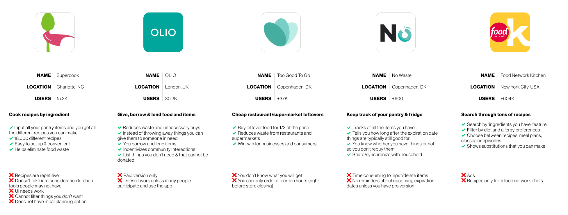
Understanding the Football app market
I conducted some competitive analyses of Football apps and social media apps. Below are the conclusions from each.
So, who will be using the app?
I started my research by screening potential interviewees to see if they had were football fans and if they used any social media apps. This led me to interview five research participants and create personas based on the main characteristics.
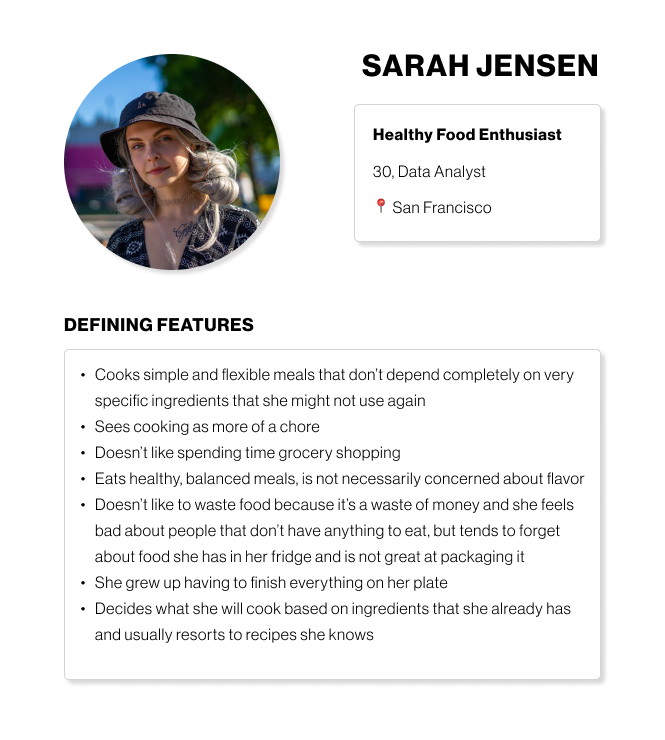
What are Sara, Alex and Johan's pain points?
Through the interviews, I was able to identify common pain points that users have when it comes to cooking. Based on these learnings I was able to narrow down key features that would differentiate the Football community app.
01 / Limited time for deep engagement.
All users face time constraints that prevent them from fully participating in football content, discussions, or watching matches, making it hard to stay deeply connected.
02 / Struggle to find relevant content.
They each have specific interests—tactics, nostalgia, or fan debates—that aren’t easily met by mainstream football media, leaving them searching for more personalized content.
03 / Lack of social connections.
Despite their passion for football, they find it hard to engage meaningfully with others who share their specific interests, whether in tactical discussions, nostalgic conversations, or peer feedback.
04 / Frustration and disconnect.
All users feel a disconnect, whether it's frustration over team performance, difficulty applying tactics, or missing the camaraderie of live games, seeking a more fulfilling football experience.
Designing a sitemap
I created a sitemap in order to start visualizing how the application should be organized. The main navigation will contain a home screen, spaces, discover, games and rankings.

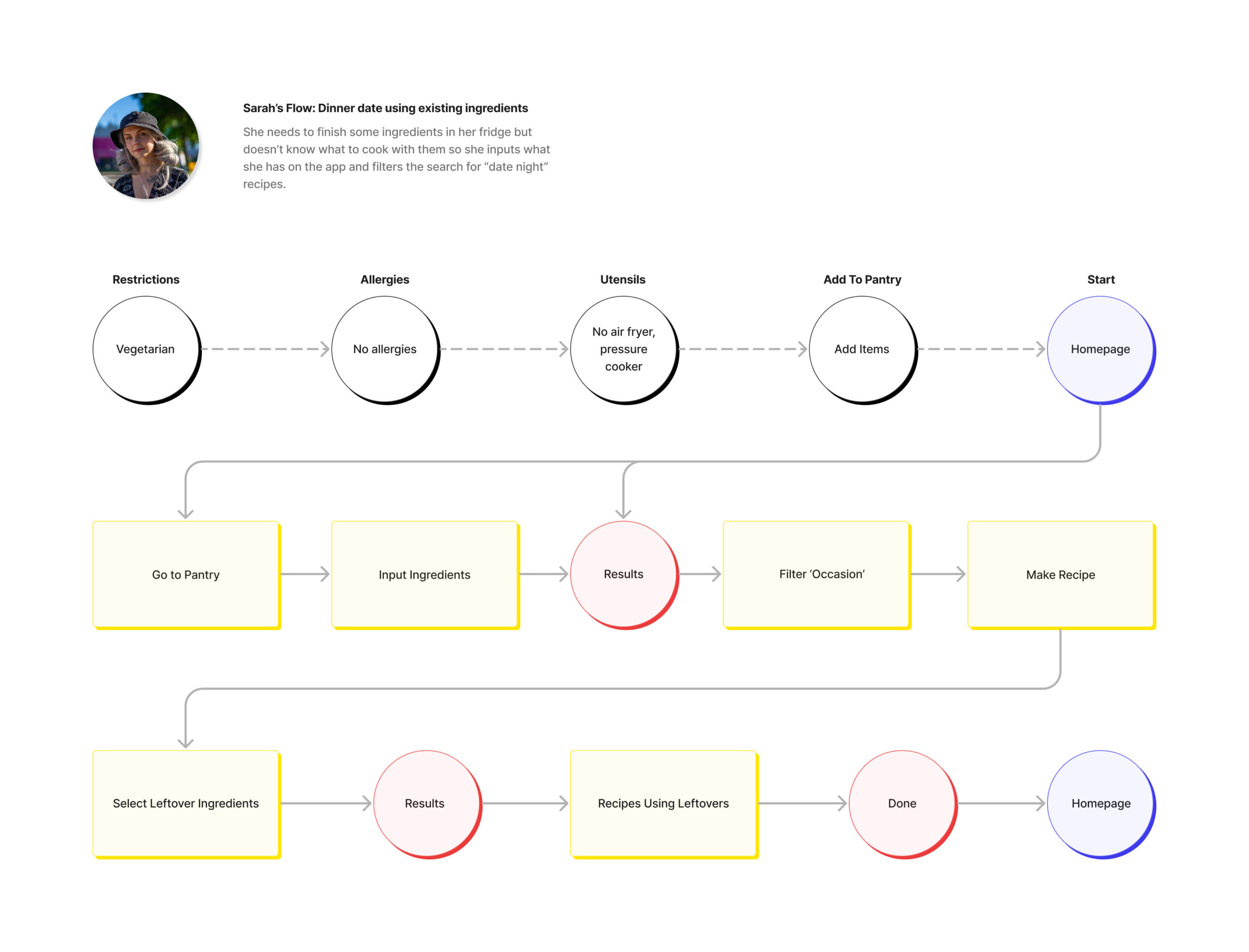
Developing the wireframes
I created two different user flows showing Sarah's and Anna's journey through the app. Sarah's flow focuses on planning a quick and easy dinner based on ingredients she wants to finish, while Anna's flow focuses on her meal prep plan for the week.
Usability testing
I conducted usability testing on five new candidates. I asked them to walk me through a few different scenarios and then asked what their overall impressions were, whether anything was unclear to them at any moment and if there was anything else they wish they could do.

How can it be improved based on user feedback?
Below you can find some of the revisions based on the usability testing insights.

Lack of clarity regarding onboarding information input by the user.
During the usability testing, I noticed that the onboarding needed to be shortened to the absolute minimum that was necessary for the users to understand the app. In the final version, it was integrated into the start screen.

Quick access to the user spaces is prioritized over the discover.
Users were confused by the variety of options in the first prototype, so based on the feedback the spaces tab is showing first the spaces they are a part of.

The spaces themselves need an extra explanation page before a user joins.
Users that joined a space did not bother to check any of the rules, so it became apparent that the rules should be in an extra screen that would appear if the user chooses to join.

Overall lack of clarity as to what the purpose of the spaces is.
In the original prototype, the onboarding did not explain enough about the spaces. In the revised version I condensed the onboarding and redesigned the cards so they include an explanation.

There is confusion about the meaning of “all” in the home tab.
The "all" tab in original prototype created uncertainty for users as they did not understand the difference between that and "official". In the revision, it was changed to "home" and "feed" which were more intuitive.
The Solution 💡
Problem 01
Not having enough time to engage in football related content.
Solution
The app would allow users to view the most relevant football content.
Users view live videos, check their spaces and see upcoming events within the same screen.
Problem 02
Users struggle to find the relevant content they want to engage with.
Solution
Ability to curate which football spaces they're a part of.
Users can input their preferences when they are onboarding and they can access relevant content in the spaces tab.
Problem 03
Users lack relevant community connections.
Solution
The feed tab allows users to connect with the community.
The user can filter the community posts by going to the feed and interacting with other users.
Problem 04
Users don't feel like they have a voice.
Solution
A public user profile with relevant information helps the community become more vocal.
Users can set their profile to show as much information as they wish to share and they can also connect with other users.
Final thoughts
Learnings
🔍 Understanding what is missing.
Social apps are trendy, but we needed a way to make this one stand out. Focusing the project into collaborative and community based app was a way to help us differentiate from the other socials and create a strong concept.
📈 Building in versions is better.
Due to the limited timeline of the project, we needed to get a minimum viable product out so it required a lot of collaboration with the developers. We looked at the scope and prioritized based on what was essential.
Next Steps
🕹️ Building out games and rankings.
The next phase of the project would consist in building out the games and rankings screens.
💡 More usability testing.
I would proceed by testing most up to date designs on users in order to identify possible issues.
Selected Works

Road CodeA Professional Cycling Platform

PickleA Recipe App To Help Eliminate Food Waste

iOS WeatherAdding A Personalized Notification Feature

VCorp Latin AmericaA Small Business With A New Identity

ZeitAn Innovative Way To (Time) Travel

South Carolina VillaResidential House Project For A Growing Family

2 Finsbury AvenueSustainability Research & Strategy For An Iconic Tower

Shenzhen Natural History MuseumAward Winning Museum With A Holistic Sustainability Strategy

Reinventing Cities, MilanDesigning A Masterplan That Fosters Community & Wellbeing